In the previous posts of our blog, we talked about what is a poster presentation and how to create a good poster presentation, and how to create an effective electronic poster presentation. Today, we are going to talk about how to create and attractive and effective poster.
In this post, we are giving you some tips and telling you the steps that you should follow to make your printed poster more attractive. Of course everyone needs to feel free when we talk about being creative —nevertheless, sometimes we need someone to give us a hand. Let’s see how to create an attractive and effective poster!
How to create a poster – Tips to make it attractive and effective
At PosterSessionOnline, posters are our favourite design projects. But this is for a good reason, and it is because they allow us to be very creative, amazing, and they can provoke a lot of different emotions in people too.
Some posters make you feel excited and thrilled, but others are full of information. Some of them may contain much more information than others but, the key is finding the right balance between headline, copy, images and logos. If you find that balance, you know how to create a very attractive poster.
Above all, you need to know your audience likes, buying habits and culture, as well as the product, service or event you are offering them. This is a critical factor to bear in mind if you are wondering how to create a great poster.
Colours, fonts and graphics complement the information we want to transmit. So, here below we have created a list where you will see tips among which you will find the perfect design theme to convey your message. Let’s see how to use those factors to create a nice poster!
Colour
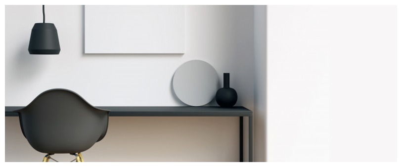
How to create energy in a poster? Use the colours! They create energy, elicit a favourable mood and attract the audience eye. Colour is a wide open aspect of the design. Depending on the poster subject, the colours will be bold, subtle or romantic. You can really give power to your poster just with colour.
We also recommend you to use blocks of solid colours or limit your colour palette. Ensure that the colours you choose work well together, and you will be able to achieve a striking background.
Typography
If you want to create a greater impact, we strongly recommend you to experiment with typography. You can convey many different things from the fonts. If you want to show seriousness, use a bold sans serif. If you want to enhance elegance, do it with an italic serif — or if you want to express cheerfulness or fun, use a loose handwritten font.
We recommend you to choose at least two kind of fonts — one for the headline and another one for the body. If you are going to experiment with typography, make sure your accompanying fonts are clean and simple.
Visual hierarchy
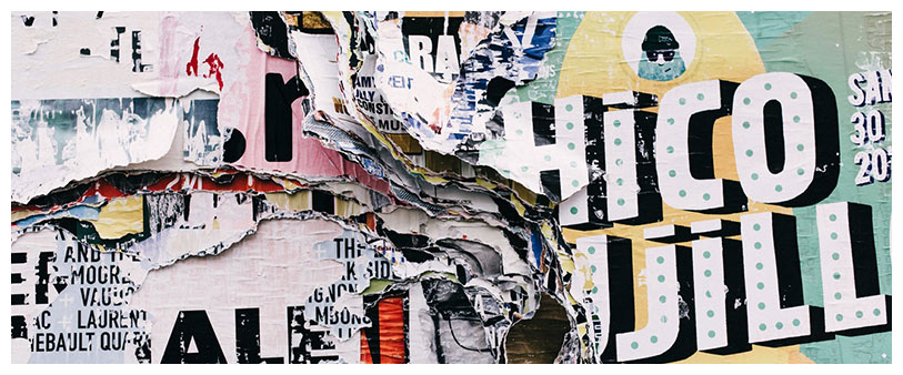
You should create visual hierarchy. Posters have to attract attention and be a quick read. So, rank your information in order of importance. If you are working with little copy, we recommend you to go for a bold, simple graphic or a photo. If you have lots of information, think about a big headline and cluster the information into chunks.
Remove unnecessary elements
You should remove unnecessary elements. We are quite sure that you have heard that sometimes, less is more. It creates intrigue to the audience. A single word or a dramatic image can convey so much more than lots of words or photos. Don’t add extra graphics or words just for the sake of adding more. Sometimes it is better to say more with less.
Shapes
If you use shapes, they create other shapes. This means that they create guide lines which lead the viewer’s eye around the poster. Create an interesting composition or lead the reader’s eyes in a particular direction – the use of shapes in poster design is very effective. So we recommend you to use shapes in order to create visual interest.
Depth and dimension
How to create depth and dimension on a poster? Layering images, colours and words create depth and dimension. You can create a nice sense of depth using strong shadows to make the composition seem 3D. You can also place the text in the layout next to objects that relate to their meaning. We strongly recommend you to play with layering to create depth and dimension.
Create energy and drama
We recommend you to emphasize elements to create energy and drama. When you use exciting and stimulating photos, illustration and even fonts, you create a serious impact. This way, you definitely get a reaction from the viewer.
Clever perspective
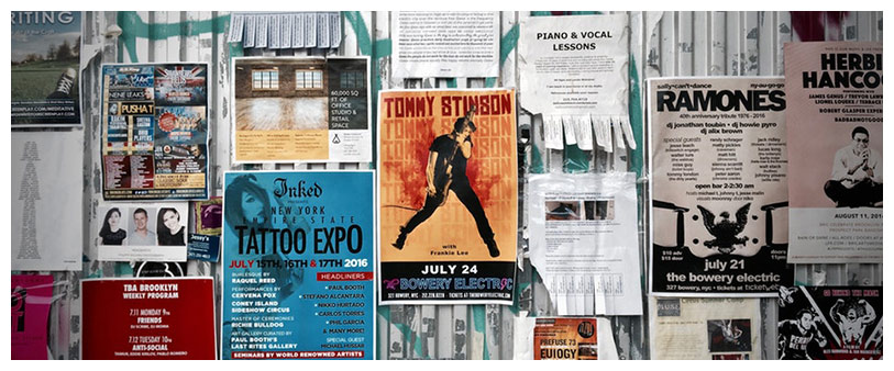
Take the viewer’s focus on a journey with clever perspective. We don’t always need to use the straight line. If you use different angles and points of view, you can create a more exciting poster. You can change the point of view of a picture, or take it from up high or down low. You can also use words on a diagonal instead of straight line.
Balanced composition
How to create a balanced composition on a poster? We recommend you to use symmetry, centring and repetition, this way you will create balance for the eye. You can balance colours, amount of text, weight of graphics, or a mix of all of them.
Balance is not a synonym of a perfectly centred poster. To be symmetrical doesn’t mean that it has to be the same on each half, but that one side isn’t heavier than the other —so, it doesn’t contain all of the information, pictures or graphics.
Photos
Using photos to lend credibility to your poster is a must. If you use a beautiful or dramatic picture, it may convey your message. Photos provide credibility to your product, and they make it real, so the audience can see its quality.
Illustrations
We recommend you to use creative illustrations, due to photography may not always suit your needs, or maybe you don’t have enough budget for photography. Using an illustration, you can create your own characters and convey the message as you desire. You can create a whole world designed exclusively for your purpose. You have the chance to create your illustration flat or with layers and depth. As you wish!
Graphic elements
Ensure all of your graphic elements flow together. Make sure you know how you want the audience to get the information. You can achieve that using colours, size, lines, and weight of text. It is a way to create a path for viewers to follow.
Legible information
Make sure that you make dense information legible. It doesn’t just mean that the audience can actually read the poster, but they are conscious that you are advertising, selling or promoting. Make sure that your poster is easy to read and understand, and make sure that it can be seen from a distance too.
Format and size
We recommend you to pay attention to formatting and size, because not all posters are designed the same, as they are not supposed to have the same size. You can vary the actual size of the poster if you are allowed to do it. There is no need that the poster is always vertical, so try horizontal. Go big, go bold, go different.
We hope our tips on how to create a poster have been useful, but if you have any doubt, don’t hesitate to contact us! We will be pleased to help you anytime.

