There are some colour combinations that work more effectively than others when it comes to making your poster being attractive for the audience. Do you want to amaze your audience eyes? Today, at PosterSessionOnline we want to tell you how to choose the coolest colour combination for your poster. That is the reason why we have written a list with some tips thereupon. You will need to know these tips about colour in order to choose the best colour schemes to create your poster.
Colour combination tips to create your poster
Down below, you will find a list with some tips about colour combination that will help you out to create your poster.
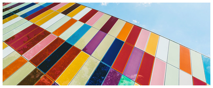
It is not necessary to use all the colours of the rainbow
If you are creating a poster to announce candy, it is fine. If not, forget about using all the colours of the rainbow — that won’t make your poster attractive at all. The other way around, your poster will look messy and all the colours will clash with each other.
Remember using the rule of three colours and use the minimum amount of colours possible each time. Most of the times, two or three colours can be really useful.

Use the white space, don’t be afraid of it!
You have to leave white space on your poster. Don’t jam the area with bright colours and more information than needed, or the audience won’t be interested in your poster. If you add some white space on your poster, that will allow better readability. Therefore, your poster will be more attractive.
Take a walk on the dark side
Some people seem to be afraid of dark colours, but most of the times they can be your best ally. When it comes to creating your poster, remember that the dark colours show up better on a white background than the bright colour combinations, even if they are on a dark background. We strongly recommend you to stay away from primary colours, like reds on blues or reds on yellow. They could seriously damage your audience’s eyes.
Feeling blue is not always a bad thing
Blue and green tones can take your poster from monotonous to fabulous. These colours match tend to go well not only together, but with faded red and yellow tones. The pink tones also match with shades of blue, such as powder blue or navy. Green shades like mint and evergreen can make a pop colour combination with blues too. If you stay in the blue family, you will have a great poster for sure!
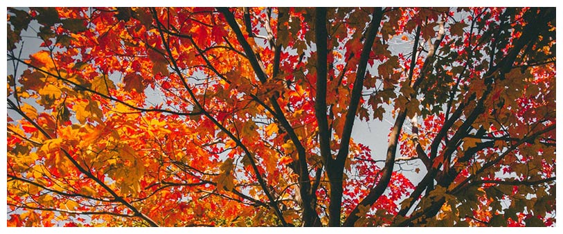
Try to avoid the autumn colours
There are some colours — like yellow, red and orange — which are traditionally known as autumn colours. There is nothing wrong with autumn, but these colours can overpower the message of your poster.

In short, we could say that these colours evoke a sense of warning, or even danger. So, unless you are making a poster to warn about something, you should avoid using these three colours combination.
Keep it professional
In terms of colour design, it doesn’t really matter the aim of your poster — the best option for it is to look as professional as possible, come what may. Some tones of brown, blue and black are always a good option.
The best colour combinations to create your poster
Subdued and Professional
Blue and red are some of the colours most commonly used for branding by businesses. This is due to a good reason. Blue colour conveys calm and trust, while colour red indicates confidence and power. This colour combination transmits a little bit of both feelings.
If you are more conservative, we strongly recommend you to use blue and grey tones. If you want, you can use a brick red shade — it adds a burst of extra colour, but it is still a very professional colour combination.
Icy Blues and Greys
You can try to contrast warm grey tones with cool and glacial blue tones. That will create a dynamic colour scheme, which result is more visually interesting than the average combination of monotonous blues and greys. This is also a good option if you are looking for a more restrained palette, instead of choosing a navy or a dark grey. Try these bright and light tones!
Cool Blues

We highly recommend using monochromatic colour schemes, because they are very flexible. If we talk about cool blues, we could say that the colour palette may not be considered monochromatic in technical terms. Nevertheless, it creates a very similar effect for visual purposes. Using a colour as versatile as blue, the colour combination could be used in practically any kind of poster.
Fresh and Bright
Colourful blossoms and fresh greenery always make springtime a welcome sight after a long and dark winter. If you decide to use this colour palette, which features bright shades of coral and green, it will make your poster design super attractive. These colours combinations are perfect to be used for a spring or summer-season event poster.
We hope that you have enjoyed this post about choosing the coolest colour combination for your poster. If you have any doubt or if you need further information, don’t hesitate to contact us! We will be pleased to help you anytime. Remember, forget about the poster queries — we take care!


